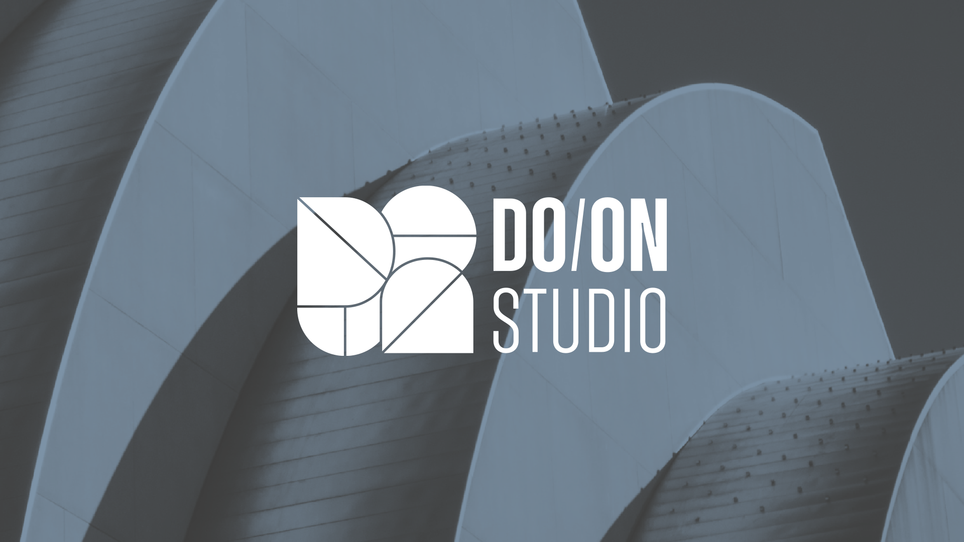
Welcome to DO/ON, where architecture meets minimalism and creativity thrives. Our logo design embodies the essence of our firm: precision, partnership, and the beauty of simplicity.
Crafted from geometric forms, the word “DO/ON” is ingeniously sliced in two, representing the collaborative spirit of two founders. Each element of the logo—a testament to the synergy between individuals—speaks volumes about commitment to teamwork and innovation.
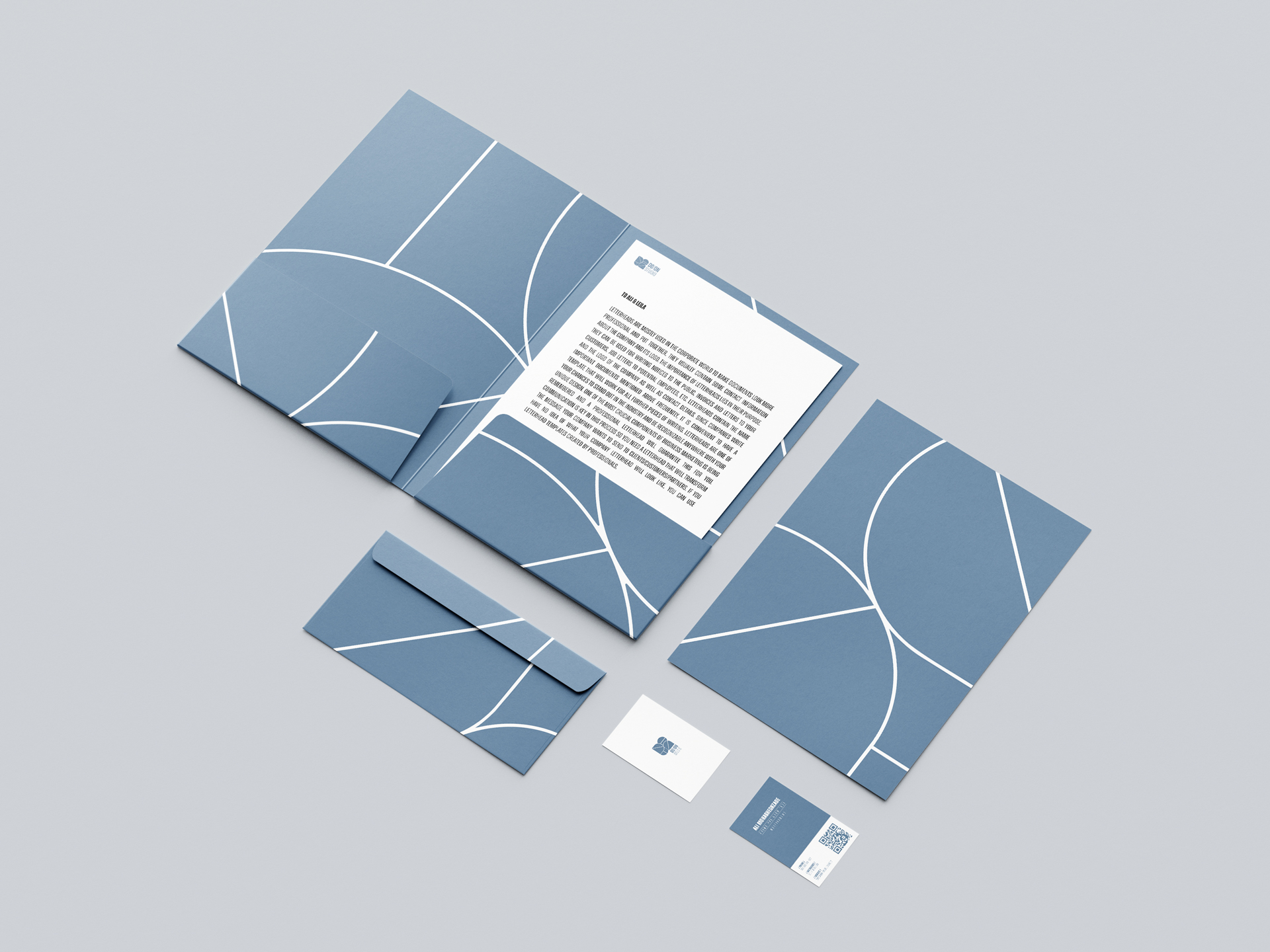
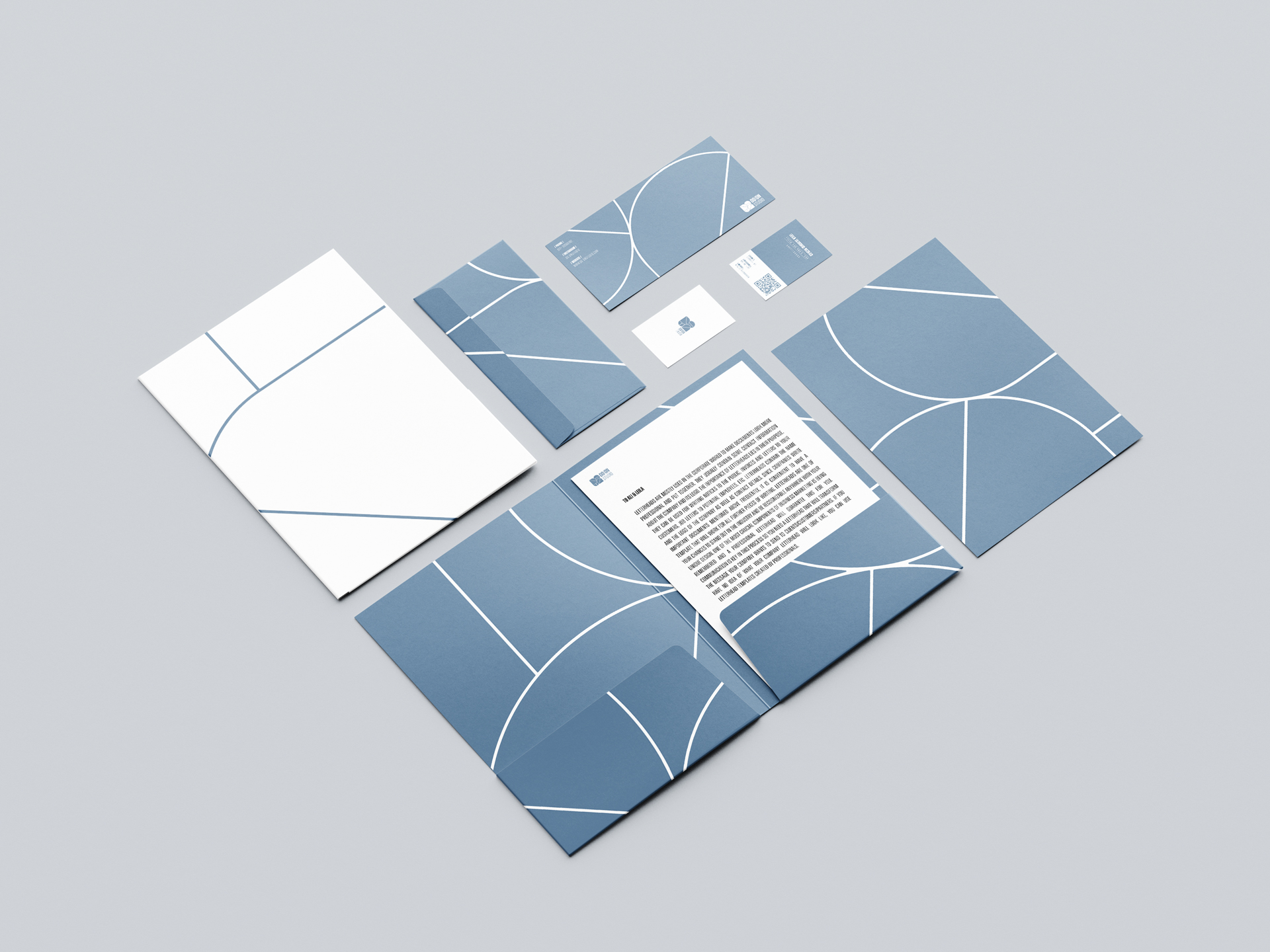
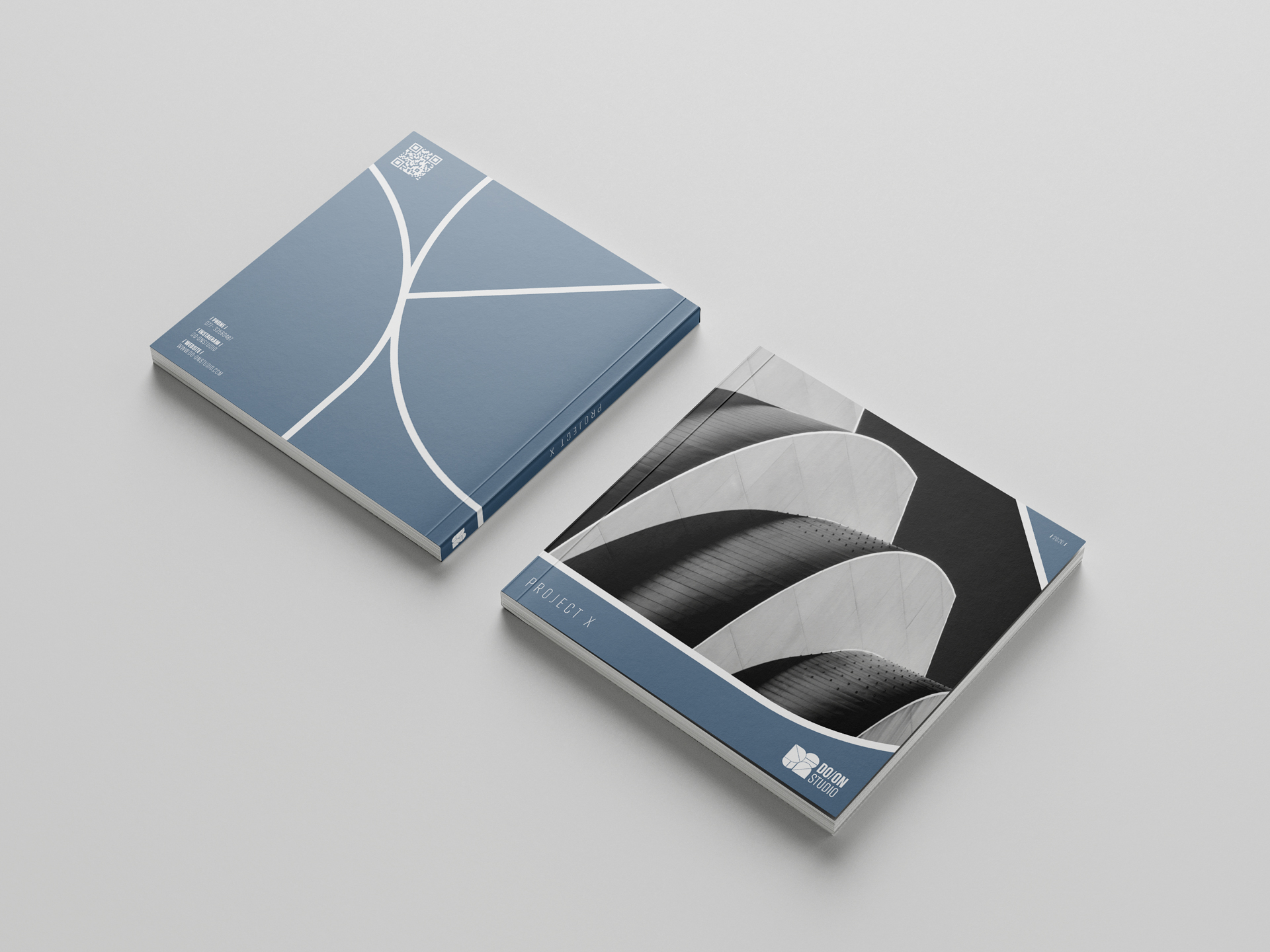
Incorporating circles and arches, our brand identity reflects our belief in timeless design principles and the seamless integration of form and function. The soothing sea blue color palette serves as a nod to our coastal surroundings, grounding us in the natural beauty of our environment while inspiring creativity and calm.
At DO/ON, we’re more than just architects; we’re storytellers, visionaries, and partners in realizing your dreams. Join us as we embark on a journey of transformation, where every project is a testament to the power of collaboration and the elegance of minimalism.